Introduction
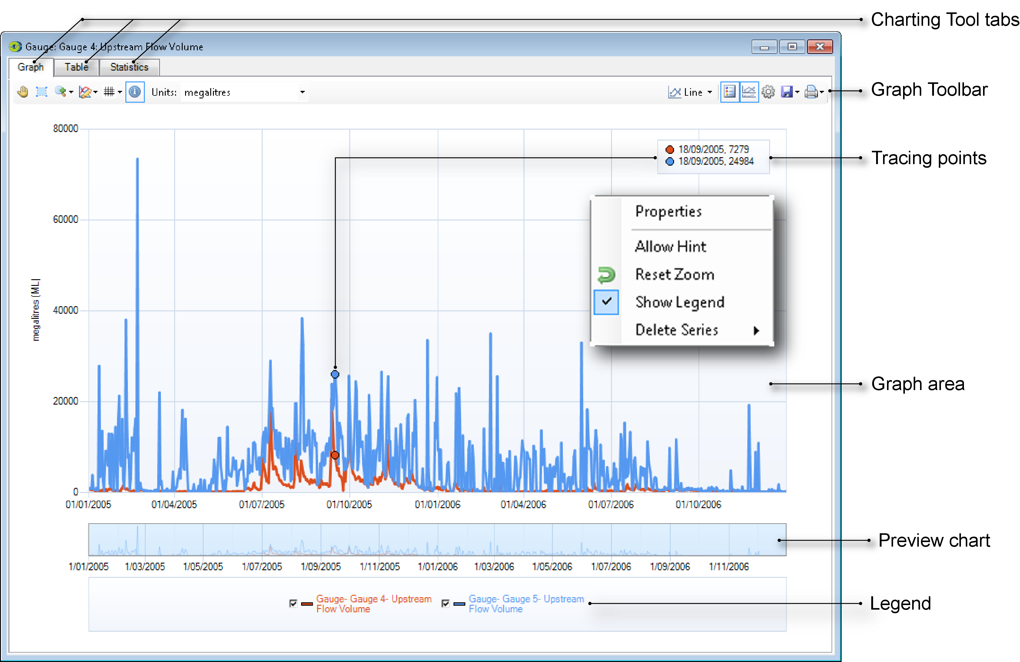
The Charting Tool allows you to view the result set from a scenario run in different formats. It is available from a number of places within Source, including from the list of result sets in the Recording Manager and from within any feature editors that can load time series. Figure 1 shows the main features of the Charting Tool. The Graph tab provides a graphical representation of data, which can be customised using the Graph tab toolbar. The Table tab displays the results in a table, and the Statistics tab shows a summary of the data.
Figure 1. Charting Tool (main characteristics)
Graph tab
The Graph tab provides a graphical representation of your data and allows you to change the appearance of charts. In addition to displaying a single result set and derived views such as exceedance curves, you can combine two or more result sets. Once a charting tool contains two or more graphs, additional capabilities become available such as difference graphs and scatter plots.
Although the Graph tab allows you to combine results sets, actions taken in the Graph tab also affect both the Table and Statistics tabs.
Graph viewing options
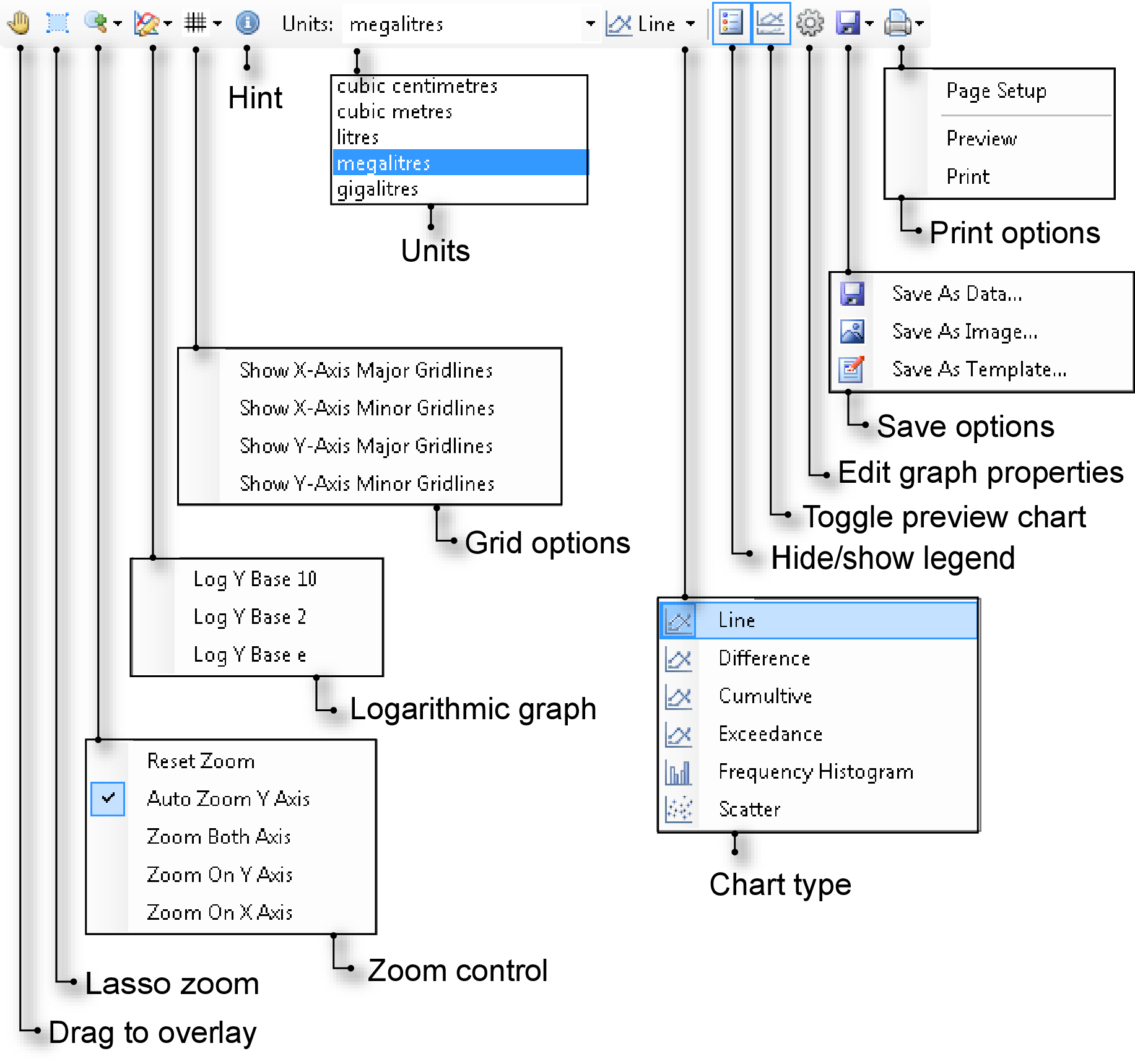
You can control the behaviour of graphs using the Graph tab toolbar (Figure 2). The functions of each of the buttons and pop-up menus on this toolbar allow you to change how charts are displayed. These are explained in further detail next.
Figure 2. Graph tab toolbar
Combining graphs
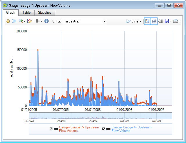
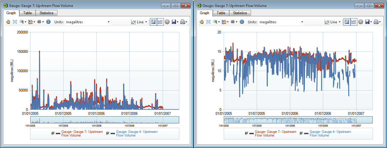
Draggable allows you to overlay one chart onto another. There is no limit to the number of charts that can be overlaid. Each chart is assigned a distinct colour and is represented in the legend. Figure 3 contains an example of two overlaid charts. Note that when combining graphs, the units stay the same on the target chart. You can also use Windows Explorer to combine graphs from two different projects:
- Click on the Table tab in the charting tool for one of the projects;
- Export the data as a .csv file;
- Open a destination chart on the the second project (the target chart on which the first set of results will be overlaid); and
- Drag the .csv file from Windows Explorer onto the target chart.
You can use this method to import any .csv file into an open chart view.
Figure 3. Graph tab (overlaid charts)
To overlay charts in the Charting Tool:
- Open at least two charts and decide which one will be the target (the chart onto which other charts will be overlaid); and
- For each source chart, click Draggable, then click-and-hold the mouse pointer on the content area of the chart; drag the mouse pointer to the target chart and release the mouse button.
If required, the target chart will re-scale to accept incoming data.
Multiple charts can also be assembled directly from the Recording Manager:
- Select one of the result sets that you wish to combine by clicking anywhere on its row except the Values column;
- Hold down the Ctrl key, then click any additional rows using the same method; and
- Right-click on any one of the selected rows and choose View Selected from the contextual menu.
You can save the time series data by right clicking, then choosing Save Selected from the contextual menu. Refer to the Recording Manager.
When multiple charts are overlaid using the Recording Manager, the last-selected row becomes the target chart. Note that when combining graphs, the units stay the same.
Zooming
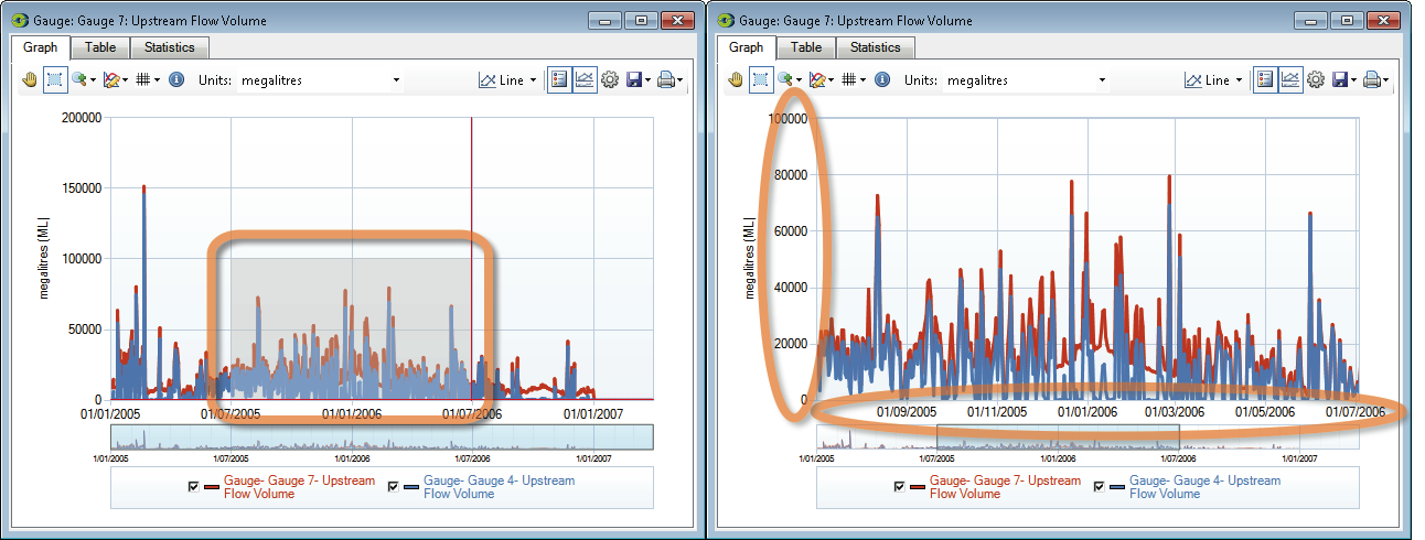
You can affect how zooming behaves using the Lasso Zoom button in conjunction with the Zoom Control pop-up menu. By default, you can zoom in and out using the mouse scroll wheel. Scroll the wheel up to zoom in, and down to zoom out. Figure 4 shows an example of zooming into a chart. The preview chart shows which part of the chart is being displayed The options available with Zoom Control include:
- Reset Zoom. Resets the zoom level of the chart to 100%;
- Auto Zoom Y Axis. When you scroll using the mouse, this option will automatically zoom the y-axis to the maximum value in the zoomed x-axis values;
- Zoom Both Axis. Both the X and Y axes are zoomed in this mode. This is the default;
- Zoom on Y Axis. In this mode, only the Y-axis is zoomed. The X-axis remains constant; and
- Zoom on X Axis. In this mode, only the X-axis is zoomed. The Y-axis remains constant.
Figure 4. Graph tab (Zooming in)
Logarithmic axis
You can choose to display the Y-axis of the chart on a logarithmic scale. You can choose to display the results in base 10, 2 or as a natural logarithm (base e). Use the Log Y-Axis pop-up menu for this, which can be useful where data ranges are wildly erratic or contain extreme spikes. Figure 5 shows a chart in log base 2.
Figure 5. Graph tab (normal Y-axis, left; log base 2 Y-axis, right)
Gridlines
You can view or hide the grid lines on the graph using Toggle Gridlines. This pop-up menu allows you to view the major and minor grid lines on both axes. You can create various combinations using the four options in the pop up menu.
Tracing points
The Hint button displays and reads the x and y coordinates of values from the graph by "tracing" points on its surface. For example, Figure 1 shows the cursor positioned over a peak in the graph and the value at this point is shown in the detail area. Click the button again to hide these controls.
Changing units
To change the units on the Y-axis, make the appropriate selection from the Units pop-up menu. Note that it is your responsibility to choose appropriate units.
Multiple charts
When a graph contains at least two data sets, you can obtain alternative views of them. The data set associated with the original target graph is treated as the reference and the other data sets are interpreted with respect to that baseline.
Changing chart types
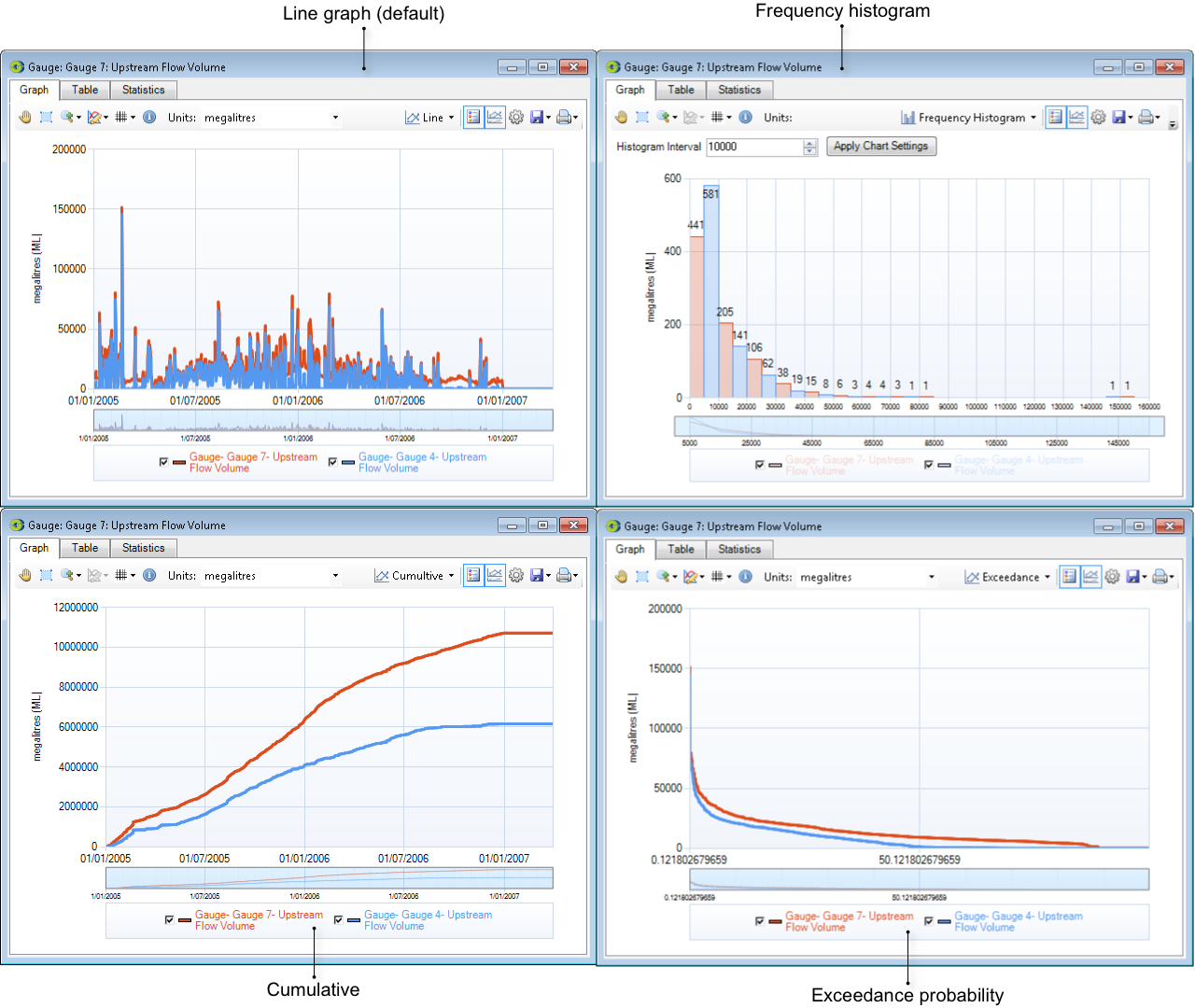
Use the Chart Type pop-up menu to choose the type of chart to be displayed. If there are multiple charts, a total of six options are available. The first four in the following list can be viewed for single charts as well:
- Line is the original form (usually a time series);
- Cumulative displays the cumulative total volume (on the Y-axis) over time;
- Exceedance keeps the Y-axis constant but calculates the probability of exceeding Y-axis values on the X-axis;
- A Frequency histogram shows how the data values are distributed. Change the value in the Histogram Interval field and click Apply Chart Settings, to re-draw the chart with the new interval;
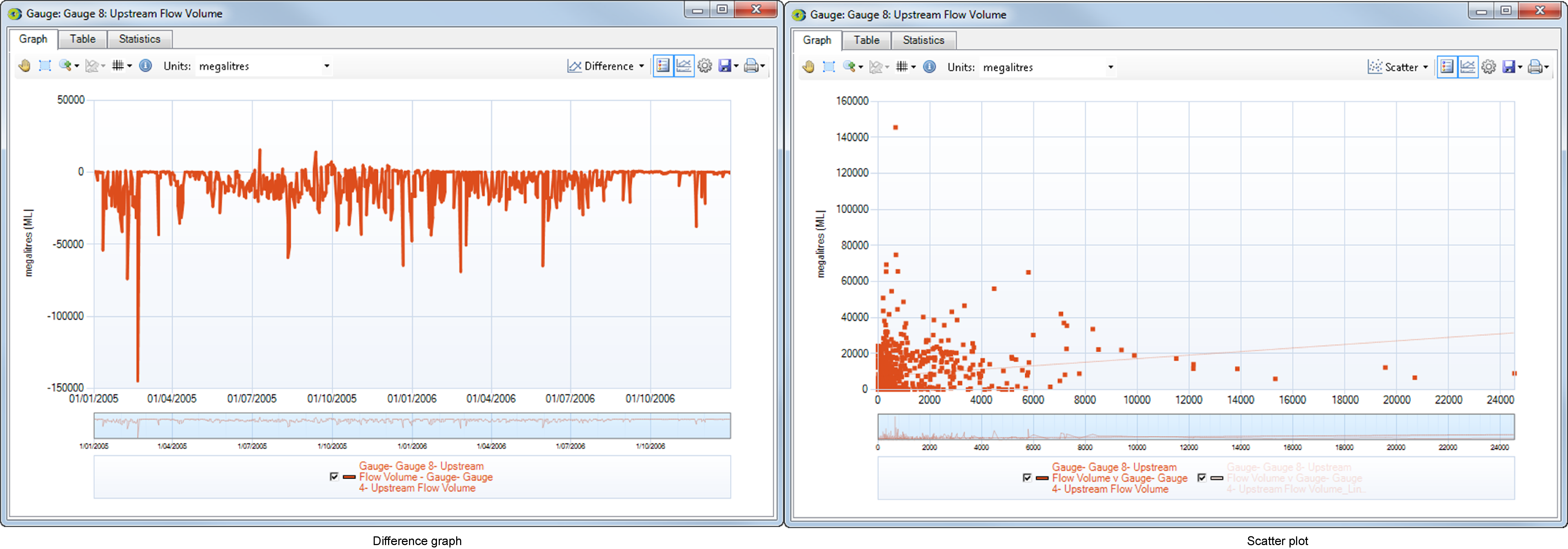
- Difference graph - the X-axis remains invariant and Y=0 represents the baseline. Differences between each overlaid data set and the reference point are plotted; or
- Scatter plot - the Y values from the target graph are placed on the X-axis and (X,Y) coordinates are plotted based on common X values in the original data sets.
Note that Difference graphs may be dragged onto other graphs (and vice versa). However, Scatter plots can only be the targets of graph-dragging actions.
Figure 6 shows the charts available only for single sets of data. Figure 7 shows two additional charts available for multiple data sets.
Figure 6. Graph tab (types of charts for single data sets)
Figure 7. Graph tab (types of charts for multiple data sets)
Legend
To toggle whether the legend is displayed or not, use the Hide/Show Legend button. This is useful when multiple graphs are overlaid, and the legend consumes a considerable amount of space. It is equivalent to right-clicking the chart and choosing Legend in the contextual menu.
Preview chart
You can toggle the appearance of the preview chart using the Toggle Preview Chart button. Just as with the legend, it is useful when multiple graphs are overlaid.
Customising charts
You can customise the appearance of individual graphs using Edit Graph Properties. This button opens a panel where chart settings (eg colours) can be adjusted. It can also be accessed by right clicking on the chart, then choosing Properties in the contextual menu.
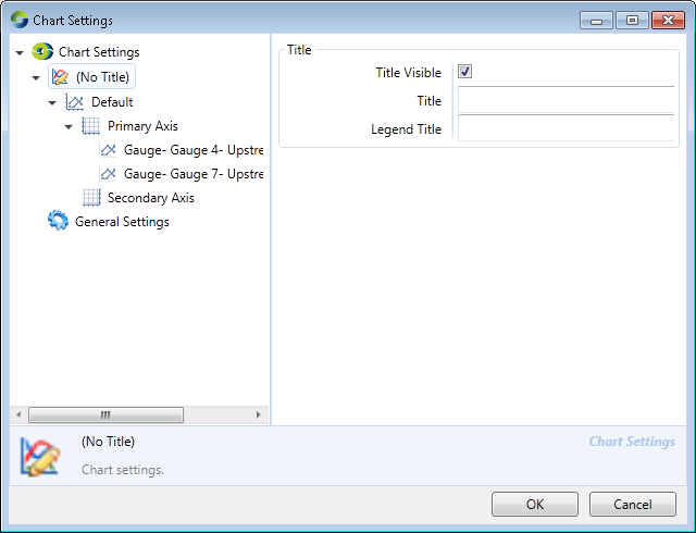
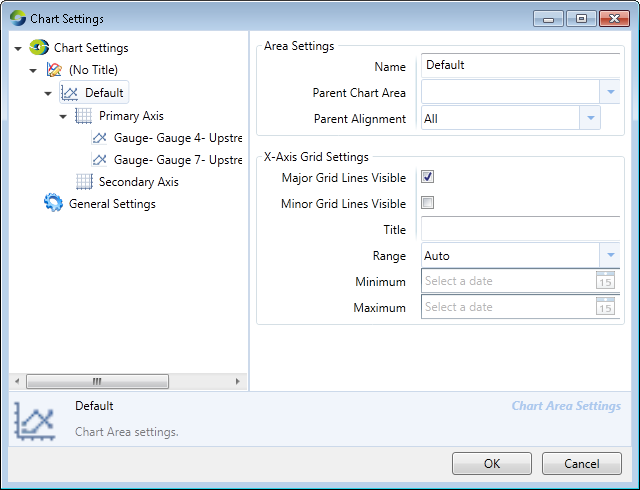
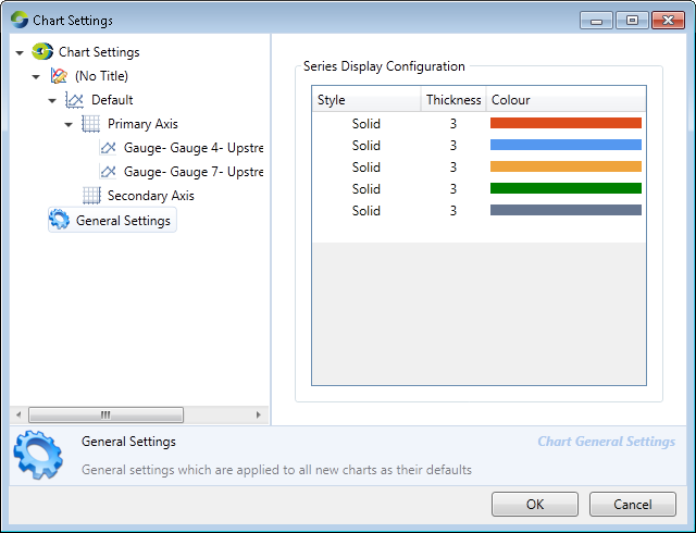
The Chart Settings dialog (Figure 8) contains two panels: an index panel on the left and a properties panel on the right. The index panel on the left selects between groups of related properties. These include:
- Title - Customise controls for chart titles (Figure 8);
- Area settings - You can create areas, which may consist of many series. This will be displayed as separate charts. You can also customise controls for both the X and Y axes (Figure 9); and
- General settings - Customise chart display information (Figure 10). These settings are applied to all new charts as their defaults and can be accessed using the command.
Figure 8. Chart Settings (Title)
Figure 9. Chart Settings (Area settings)
Figure 10. Chart Settings (General settings)
Saving and printing graphs
You can save and print graphs using the Save and Print options pop-up menus. The former offers a number of ways in which data can be saved from the Charting Tool. This includes saving as data values, as an image, or as a template for use by the Chart Manager. The latter provides access to printing tools.
Table tab
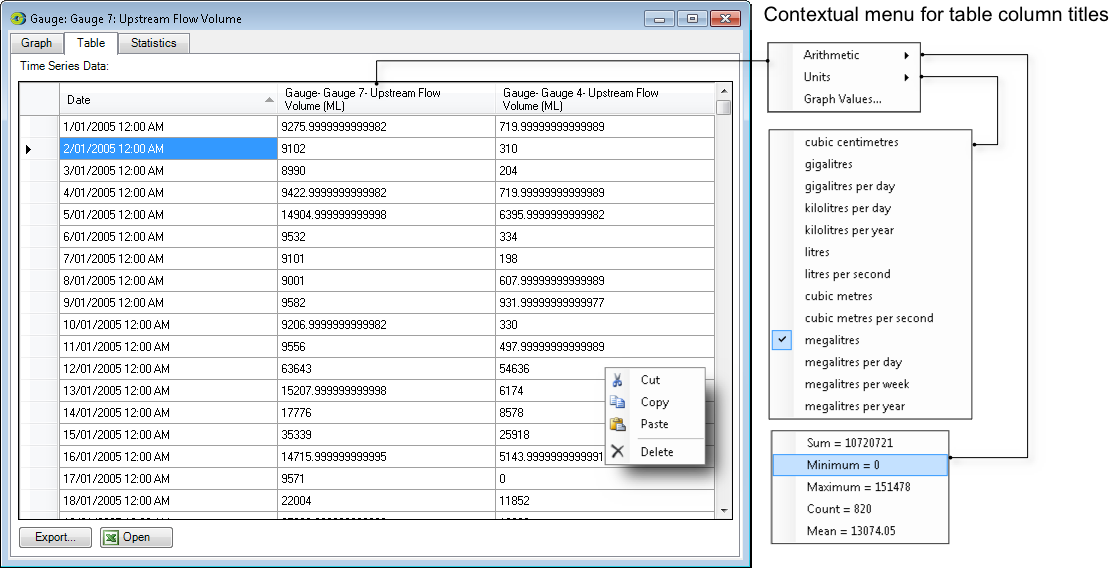
The Table tab (shown in Figure 11) provides a textual representation of your data. In the simplest case where you open an instance of the Charting Tool with a single time series, the Table tab will contain two columns, one with time-stamps and the other with observations corresponding with that time-stamp.
Figure 11. Charting Tool (Table tab)
If you assemble two or more graphs in the Graph tab, the Table tab will contain additional columns, one per dragged graph, with the observations aligned with respect to time.
Data can be sorted using the values in the two columns by clicking the column headers. Successive clicks in the columns will switch between ascending and descending sort orders. The small grey triangular arrow at the end of the column indicates the direction of the sort order.
Data can be copied by right-clicking anywhere in the table and selecting copy form the pull down menu that appears. The data copied will depend on which rows are selected.
- To select the entire table for copying click the top left rectangle to the left of the column headings. The entire table will be highlighted in blue. Now right-click in the blue area and select copy.
- To select a single row for copying, click the empty rectangle to the left of the row. The selected row will be highlighted in blue. Now right-click in the blue area and select copy.
- To select a single cell for copying, click inside the cell. The selected cell will be highlighted in blue. Now right-click in the blue area and select copy.
- To select a single column for copying, click the topmost cell in the column and drag down to keep selecting cells underneath to the required point. The selected cells will be highlighted in blue. Now right-click in the blue area and select copy.
Time-stamps cannot be edited but you can paste data into the remaining columns if required.
Right-clicking in the column headers will also display some summary information about the data contained in the table. For example, the Date column displays a count of rows displayed and the Data column displays arithmetic statistics and allows the units of measure to be changed.
You can export data to .CSV and tab-separated formats by clicking Export.... Clicking Open transfers your data to a Microsoft Excel™ spreadsheet.
Statistics tab
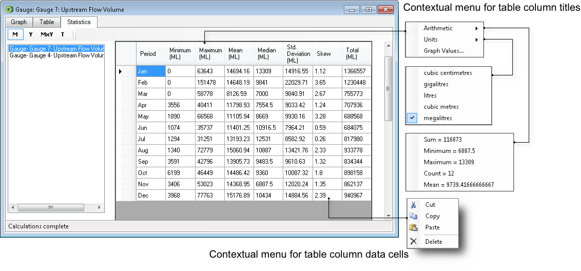
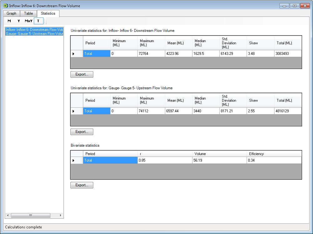
The Statistics tab shows a summary of statistical data for all the selected data rows. Just as multiple results can be displayed graphically (by overlaying), the statistics for these results can also be simultaneously displayed for comparison. The example in Figure 12 shows that there are three results available (in the left panel). Since only one is selected, it is displayed on the right panel.
Figure 12. Charting Tool (Statistics tab)
Results in the Statistics tab can be viewed in four different formats using the buttons at the top left corner:
- Monthly summary - formatted in 12 monthly rows and provides tabular statistics for all the years in the run combined;
- Yearly summary - provides annual statistics with one line representing each year in the run;
- Month by year summary - allows one row for each calendar month in the run regardless of the number of years in the run; and
- Total - provides statistical data for the entire period run.
The display can also show multiple results in the same screen, by selecting two or more results (Ctrl + click) in the left hand margin of the window (Figure 13). In order to view multiple results in this manner you need to have previously overlaid two or more graphs in the Graph tab. Instructions on how to do this are described in Combining graphs.
Note that if the table title (in the Statistics tab) is clipped, make the window larger.
Figure 13. Charting Tool (Statistics tab, by year)
Understanding bivariate statistics
When two data sets are selected in the Statistics tab, a table of bivariate statistics is calculated. It is important to understand the relevance of the information presented in this table.
The left-most column reports a value for Pearson’s Product Moment Correlation Coefficient which is usually denoted as "r". This value is calculated by performing a linear regression between the selected data sets. This calculation is independent of the dragging order. Values of r are in the range -1.0...+1.0 and are generally interpreted according to the scale shown in Table 1.
Table 1. Interpreting values of r
Range | Interpretation |
|---|---|
r = +1.0 | a perfect positive linear relationship appears to exist. |
+0.7 ≤ r < +1.0 | a strong positive linear relationship appears to exist. |
+0.4 ≤ r < +0.7 | a medium positive linear relationship appears to exist. |
-0.4 < r < +0.4 | little or no linear relationship appears to exist. |
-0.7 < r ≤ -0.4 | a medium negative linear relationship appears to exist. |
-1.0 < r ≤ -0.7 | a strong negative linear relationship appears to exist. |
r = -1.0 | a perfect negative linear relationship appears to exist. |
The Coefficient of Determination (R2) can be obtained by squaring the value of r.
The right-most column in the Statistics tab is the Nash-Sutcliffe Model Efficiency Coefficient (Efficiency). This is conventionally denoted as R2, but is not necessarily equal to the value of the square of r. It is calculated directly from the two data sets (ie without first performing a linear regression). Dragging order is important and you must drag the graph containing the modelled or predicted observations (the result of running Source) onto the graph containing the observations of the natural system being modelled, and not the other way around.
It is up to you to decide which measure of model performance is appropriate in each situation. It is also up to you to ensure that you use the correct dragging order when using Efficiency.
R2 (whether calculated as Efficiency or r2) is a measure of model strength. If it is calculated by squaring r, it will lie in the range 0.0...+1.0. A useful way to interpret a value of R2=0.7 would be to say:
70% of the variability in the modelled data set can be explained by the variability in the observed data set, with 30% due to unexplained factors.
This implies that when R2=1.0, the model has perfect predictive power and leaves nothing unexplained, but when R2=0.0, the model lacks any predictive or explanatory power. Values for Efficiency can range -∞...+1.0. When the Efficiency is negative, the combined errors in the modelled data set are larger than the variability of the observed data set. This suggests that the model lacks predictive power.
While a value of R2 close to 1.0 suggests that a model has good predictive power, you should not rely on R2 completely. Two time series may produce an R2 which suggests strong predictive power, yet discrepancies may be obvious under visual inspection. Similarly, two time series which are very closely aligned with respect to the Y-axis but which have even a small misalignment on the X-axis may produce an R2 which suggests that the model lacks predictive power. In short, you should always rely on your own judgement.
The Volume column contains a measure of the relative difference between two data sets. Like Efficiency, this measure is sensitive to dragging order and you must drag the graph containing the modelled/predicted values (the result of running Source) onto the graph containing the observed values, and not the other way around. Values for Volume can range from -100...+∞ where 0.0 indicates that there is no difference in the totals of the data sets. The equation used for calculating Volume is:
Recorder Results
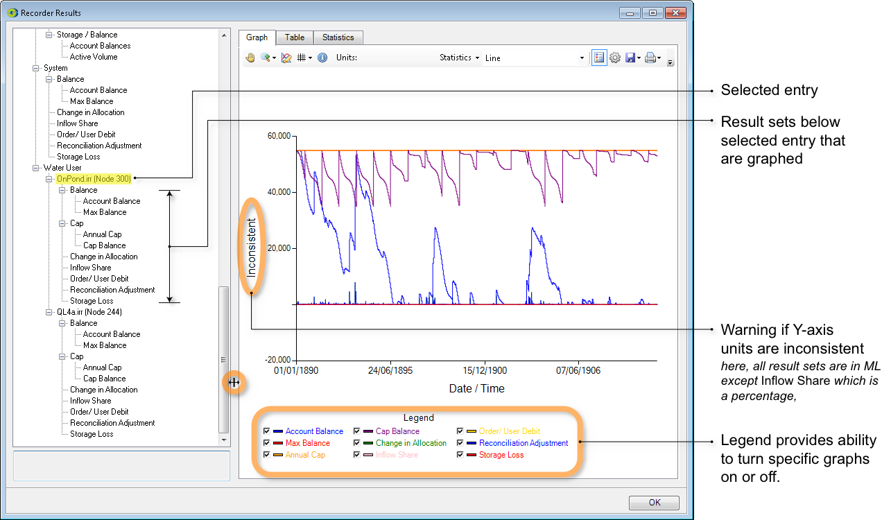
The Recorder Results window (Figure 14) is a special case of the Charting Tool. At present, it is only available for the Continuous Sharing Recorder recordable attribute of the Resource Assessment tool but this functionality is likely to be extended to other collections of result sets.
Figure 14. Recorder Results window (Graphing tab)
In effect, the Recorder Results window pre-assembles related collections of result sets and arranges them in an hierarchical display. The hierarchy contains two kinds of entry:
- structural elements are associated with a + or - symbol; and
- result set elements are not associated with a + or - symbol.
You can perform the following actions within the hierarchy:
- Clicking a + or - symbol expands or contracts the hierarchy;
- Selecting a result set element graphs the associated result set. You can use both control-click and shift-click to extend the selection to graph multiple result sets; and
- Selecting a structural element causes all entries below it in the hierarchy to become selected. All result set elements contained in the implicit selection are graphed.
Although the collections of result sets displayed in the Recorder Results window are related, this does not necessarily mean that all result sets employ the same units. When a selection of result set elements contains inconsistent units, the label for the axis will change to "Inconsistent". This situation is shown in Figure 13. This is because eight out of the nine selected result sets are expressed in megalitres whereas the Inflow Share result set is expressed as a percentage.
Each graphed result set is also represented in the legend. Each entry in the legend is associated with a checkbox which can be used to show or hide individual graphs. Changing the state of a checkbox will either:
- Trigger a check for inconsistent units. For example, turning off Inflow Share in Figure 13 would result in the Y-axis label changing to "ML". Turning the graph on again would return the Y-axis to "Inconsistent"; or
- May cause the graph axes to be re-scaled. For example, turning off all graphs except Reconciliation Adjustment (the blue trace that hovers near Y=0) would result in MaxY=8000 megalitres rather than the 60,000 megalitres shown in Figure 13.
You can adjust the relative proportions of the window that are devoted to the hierarchical display and the tabbed area by dragging the divider.
Aside from the differences explained in this section, the behaviour of the Graph, Table and Statistics tabs is identical to that of the like-named tabs in the Charting Tool.
Chart Recording Manager
The Chart Recording Manager allows you to compare the result sets of different scenario runs using the Charting Tool. You can set up a result set by dragging a number of outputs onto a single chart using Draggable. For example, say you wish to make a comparison between modelled and observed flow at a gauge node with extractions upstream of the gauge. This result set can then be saved as a Chart Template. Each time a scenario is re-run, the pre-defined result set can be viewed from the Chart Recording Manager.
This can be done as follows:
- Run a scenario and open the required chart;
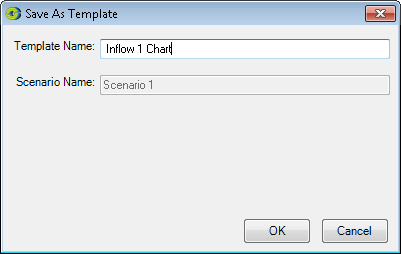
- From the Graph tab toolbar, click on the Save options pop-up menu and choose Save as Template;
- In the resulting window, enter an appropriate template name and click OK (Figure 15);
- Close the charting tool window;
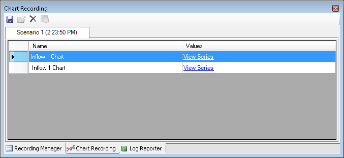
- Choose Recording Manager to display the Chart Recording tab. This will be located next to the Recording Manager;
- Re-run the scenario to display the chart (Figure 16). Click on it to open the charting tool;
- Back in the scenario, change the appropriate parameter in a node and re-run the scenario. This will update the chart in Chart Recording;
- Open the chart once again; and
- You can view charts of different scenario runs and compare the results using Draggable.
